Showing posts with label color wheel. Show all posts

Monday, April 8, 2013

Flamenco Fancy

There is something so fun about hot pink... flamenco pink to be exact.  

I've seen some fun flamenco prints floating about in the blog-world, and with that inspiration in mind, I took to collecting some of my favorite things in this hue. It's a fabulous color that would certainly inject some much needed life into... well... everything.  From fashion to art, fun chairs, pillows, and sofas, it's a very South Beach, I-don't-take-myself-too-seriously kind of color.  I'm determined now to incorporate this fun shade into my life.

I love these french doors that echo the fun pink in the flamenco framed print... and if you love this print, you can find it here.

How fun are these trousers.  Perfect for spring, and sprucing up an otherwise very simple outfit.  Love the high waist, and love the belt.

Our bathroom is tiled in what I refer to as "pepto bismol pink"... there is literally nothing left to do but embrace it, and I'm thinking that this flamenco print would be a fun thing to add.

This fun roll pillow awakens this formal space, and the greek key trim keeps it modern - not girly.

Now THAT is a pink sofa.  I could not love it more if it tried! 

I've always been a fan of the vintage print... and this one is no exception.  Sunny and fun - this would bring a breath of life into our entryway, or even the gallery wall that has finally made its way up in our living room!!

More to come on that...

If I could choose one pair of totally non-practical shoes, these would be the ones... the perfect stiletto heel, pink tassles and an ankle strap.  A party for your feet if you will...

And this fabulous Louis XVI chair - it would make a great DIY with a little fabric paint if you came upon a sad run-town version at a thrift store...

Tuesday, January 8, 2013

Pink and Gold

Ahh, happy Tuesday!  I had a fabulous long weekend in the mountains with my best friend and her family, and I am back, and refreshed!!  On my mind today??  This lovely spring-like weather SF is having... and with that, spring time colors...

Seriously, is there anything better than a color combo of pink and gold?  It's feminine, delicate, and now that Christmas is over, and Valentine's day is the next "big holiday" I keep seeing it EVERYWHERE.  I think it's such a pretty combination for everything.  It's feminine without being girly.  It's fresh, and pretty, and just screams Spring is around the corner!!

Some of my favorites??

This chair for starters... Hello beautiful - wouldn't this make a fabulous desk chair, or dining chair for the head of the table?  Even in a hallway, or best of all, in a huge, lovely walk in closet!
Source

For a party - favors and cake.  Pink and gold are right at home here!!
 Source
 Source

Fresh flowers and a pretty votive candle are perfect in pink and gold.  Imagine if those garden roses were in a gold vase.  Ugh - I want!
Source

For the daring - pink and gold wallpaper.  Perhaps the sassiest combination of these colors yet!
Source Unknown

Gold flatware is making a huge comeback - imagine an Easter table set with these and pretty pink ribbons.
Source

In art, this look is bold, but still very soft at the same time (does that even make sense??)  What a pretty combo with that brass lamp for a home office.
Source

If you aren't fully committed to pink and gold in your home, this fun wrapping paper would make any friend smile on her birthday...
Source

Or for Valentines Day, this skirt could easily take you to work, as well as to dinner with your honey, or V-Day drinks with girlfriends.
Source

Pink and gold... amazing right??  Get on board!

Friday, June 29, 2012

Dear Diary...

I've never been much on journal keeping.  It starts out with the best intentions - Dear diary, it's New Year's Day, and one of my resolutions this year is to keep a running journal.  This way I can document my life, and look back when I'm old and laugh at how funny/cool/carefree I was in my 20's. I'm going to write in you every day....

First and last entry.  Every time.


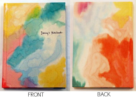
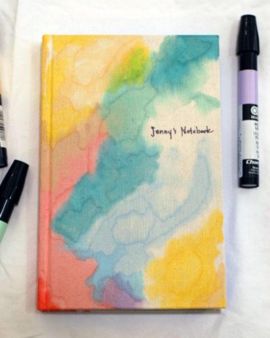
One of my favorite bloggers of Little Green Notebook is crafty, and a total genious, and had the lovely idea for her kids to make notebooks for their teachers as a gift on the last day of school.  Theirs were adorable (handdrawn pictures of what they thought their teachers would be doing for their summer vacation) but I LOVED the one she made - using charpak markers, and a blender marker.  It looks like watercolors meets tie-die, and I'm convinced that with a cool notebook like this, I could successfully keep a diary... maybe.

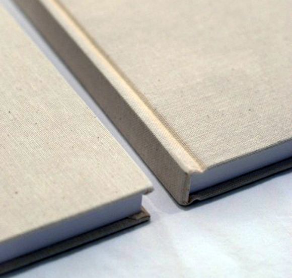
The notebooks started out looking like this:


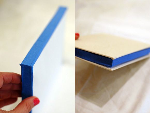
She taped them off like this (to keep the pages fresh and white):


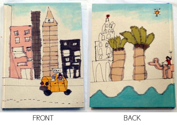
Her kids' notebooks ended up like this (so adorable):

But I just love the abstract, color wash effect of hers... might totally copy this idea


Check our her entry here!

Tuesday, February 28, 2012

Be Brave with Prints

Wild but Classy
Photo courtesy of thelennoxx.com
In the past, I have definitely taken some decorating risks.

Proof? Growing up I was very into purple... my room reflected that.  Purple curtains, bedding, sheets.  My mom and I went to town at Laura Ashley, and not only did I go purple, I mixed prints.  Purple pansy comforter, with purple gingham sheets, with a light lavender crocheted throw.  I loved that bedding, and lived with it until I was in college.  Yeahhhh...

Flash forward several more years, after moving to San Francisco after graduation from UCSB, my roommate and I decided it would be a grand idea to paint our living room orange.  After choosing a color, we decided a faux-finish would be fun.  And so we faux-finished the living room "burnt pumpkin" - OH YES WE DID!  It was glorious... my friend still lives there with her boyfriend, and our "living room" is now their dining room, and it's still orange.  Turns out, Home Depot brand paint does not fade quickly.

This brings me to present day - I've been making some "safer" choices (aka thinking my choices through a bit more), but my biggest fear is that our home will be boring.  I've seen so many overly tasteful homes where there is no flair... just beige everywhere... woof!  This is why I've decided to practice being brave with prints. A room does not have to be faux-finished a vibrant shade of orange to make a statement.  you can easily make a statement with a muted color palette, but you have to make a conscious effort to use patterns.

While an Ikat patterned chair does not seem especially practical... it is!  And why not?!  Take out the chevron love seat, and substitute in a gorgeous creme colored velvet sofa.  It still works!  As long as you love the pattern long enough to live with it for a few years, I say seize the day!  Go for it!

So here we go - I've exercised my mind, and put together an inspiration board based on patterns - lots of them.  I've chosen a muted palate of dove grey, taupe, yellow and gold (sounds strange, but I think it works).  Mixing in earthy touches balances the patterns, and somehow comes together for a eclectic yet classic look (I'm pretty sure that "classic eclectic" was not a category, but it is now).

Take a look:


The best part?  About 90% of everything on this board was from Target... oh yeah... design on a dime!  Here's the where to buy guide:

Miles of Light Photography - via Etsy 
Assorted ceramic vases - Target online


 *Each sold separately

Arched Floor Lamp 
Ikat Slipper Chair 
Unavailable Online 
Owl Lamp 
Trellis Rug 

Monday, February 27, 2012

Blog Redesign: New Blog Header

So, I've been logging some serious hours re-designing my blog header.  While I loved the greek key's, I realized that it was so similar to several other blogs that I had seen, and as frustrating as it was to head back to the drawing board... it was a must.

Take a look at the finalized iterations that have gone live on the blog - oh how they have evolved!

Aside from fully overhauling the header, I also went to work on the fonts, colors, and blog backgrounds.  I still loved the burnt coral I had before for the links and titles so that stayed.  I've also been harboring an unhealthy obsession for navy, so I've decided to keep those bold accents within the right hand navigation menu.  Outside of that, everything changed from the font, to the font sizes, to the template, to the shading, to the width... oye vey!  I picked a dark grey/blue color for the gutters (is that the word for it?) because it reminded me of dusk.  An easy decision, but I needed to find a complimentary color for the header that didn't clash with all the other colors.  A Grey header felt drab and too matchy-matchy, and burnt umber was overkill... WAY too much orange.  After many MANY versions, I settled on the lovely aqua trellis pattern with a muted navy stripe.

I am happy with it for now.  I think the aqua compliments the coral (aqua and coral... after so much talk about it, I couldn't resist), and it brightens up the whole page.  A little fading here, a little shadow there, and a little reflection to give it some personality...  Give it another few weeks, and I'm sure that I will have tweaked it some more.  As in life, nothing is ever "perfect" or "finished"... it's always a work in progress!