Showing posts with label art. Show all posts

Tuesday, September 2, 2014

Moody Ocean Prints

I'm currently in what seems to be a very slow process of  re-doing the gallery wall in our bedroom.  I just could not stomach the mis-matched (and scratched up) frames that were originally hung, and the art didn't seem to jive all-together. I want all the frames to be a single color so it doesn't seem so scattered, and I plan on replacing some of the art that is currently up there.

While I re-work the frames, and the layout on the wall, I'm on the hunt for some cool prints.  In our bedroom, we have various shades of blue, grey, and teal, and I want to bring these colors into the art in the gallery wall, keeping with a moodier, cool color palette.  Nothing too happy, bright, or playful.

I toyed with the idea of all black and white prints or photographs, but I think that might be a bit too boring unless I did the frames all gold - an idea which Kris wasn't loving. I think he could love it after it was done, but I think I abused the gold a bit in our last apartment, so I'm going to initially try a more understated route with the frames.  I think I'm going to do all grey frames and if it's too boring down the line, perhaps gold... or even navy might be fun.

Inspiration started with this first print, and kind of snowballed from there........


So my question for all of you... is all the moody ocean photography too much together?  There are a few prints we have hanging right now that I do love by Claire Elsaesser that these would coordinate with, but I'm worried that more than one will be overkill?  Should I stick with one?  Do you have a favorite?

Thoughts?

Wednesday, August 6, 2014

DIY Art - Gold Arrow Copy Cat


Hey friends!!  Happy Wednesday :-)

Not sure if you remember, but a while back I'd posted about DIY art.  It all started with the inspiration photo above from House Tweaking.  Her post is great, but the comments... yowzers!!  Apparently people had some harsh opinions about her having painted over one UGLY piece of art that she didn't love.  I myself could not care less - especially since I LOVED how the arrow art came out.  Clearly.

Loved it so much in fact that I recreated it for our own house!

May I present to you, my own version of the inverted arrow art...


It's not the easiest to photograph, especially when it's hanging on a wall in a room that is currently being used as a catch all storage area for things like empty boxes, a loveseat that we just sold, and wood.  Lots and lots of wood that will soon become a planter for our deck.

I pushed some of the junk out of the way in an attempt to stage some pretty things around the art, and it was not my best effort... for sure... but you can totally see the paintings scale here.  Its quite large.


The canvas I used was actually re-purposed - my best friend left an old black and white stretched canvas print from Ikea when she moved across the country, and it made the perfect piece for me to experiment on. No one was going to miss that print.

So I painted over it.

Two coats of white got rolled on and after it dried, I went to work taping off my arrows.  I did some vague measurements, since eyeballing the middle of a 40" canvas is not as easy as you'd think, and taped the arrows out.

I got a mix of gold paints - including a bronze, and two different shades of gold from the Martha Stewart line. Not to diss Martha, but I was not impressed.  All the metallic shades were flat (not metallic really at all) and the gold looked mustard-y to me.

Back to Michael's I went in search of the magical Liquid Leaf.  It's nice and shiny, and I've used it on projects before so I knew it would work well.


You can see close up that I painted it on thicker in some areas for more dimension - sort of a 3-D gold effect, and it looks really pretty in different lights.

The gold leaf paint dries in minutes, so I peeled the tape off as soon as I finished, and that was that. Insta-art!


I'm certainly no artist, but it was fun to play the part one foggy afternoon a few weeks ago.  

And better yet, we now have a virtually free piece of art that is a nice focal point in our junk room office.

And even better still, we didn't have to throw out a perfectly good canvas even though we didn't like the art, so I like to think we're also saving the environment... even just a little...


So easy!  Happy Wednesday friends!

Thursday, March 20, 2014

Gallery Wall Surrounding the TV


Look who was unable to unearth the camera from the many boxes still piled up in our house!!

Woot woot!

It really is the small victories in life - right??  

Well, I found the camera last night, and snapped a few pictures of the gallery wall in our bedroom this morning before getting ready for work (so ignore my reflection in the TV where I'm in my robe... love that robe btw).


As you can see, I've made huge progress since the last updates I'd posted in my "how to hang a gallery wall" post but while the frames are in place, the gallery wall is far from finished...

Want to know why???

Look closer... 

See it now??  Some of the art is hanging the wrong way... upside down, sideways... and some of it is seasonal from Christmas!  Yep, there is one reading "Deck the Halls" hung upside down.  It drives me absolutely nuts. Sadly, Kris didn't even notice it.  Men!

I'm in the process of pulling together new pieces to hang, that will be more cohesive together.  I want pieces that bring out the pretty blue of the dresser (which by the way photographed REALLY blue, but is more deep teal in real life).  I also want some more color, and lots of bright white.

Some of the prints and paintings will stay... specifically the black and white surf photograph, and a few of the Clare Elsaesser pieces that I still adore.


Originally, I'd been considering spraying all the frames either all gold, all black, or all white, but I'm kind of liking the mix of black and gold...

What do you think?


The two stacked frames in the middle (top) seem a little too thick to me, but perhaps with a wider white matte, and more simple art they won't look so clunky... the pieces that are in there right now are really dark, and next to each other look like too much.


Overall, I'm really happy with how this wall (and this room) is coming together.  It's so light and bright, and the gallery wall takes away from the big looming TV that was the lone ranger on that huge empty wall for so long.

The woven hampers flanking the TV and dresser are also new to the room, fill out the wall, and help us (aka help me) keep all the clothes off the floor.

The hampers are from Target. They are amazing.  A little pricey (roughly $50 each) but worth every penny.  They are out in the room, and the woven texture keeps them from being an eyesore.  I actually think they are really pretty! And not to go on and on about the hampers, but they have these super handy detachable liners, so when it's time to do laundry, you just un-snap them and carry the whole sack to the washing machine.  Genius!

Anyways....


Aside from swapping out the art, and a few of the mattes, I was also thinking that I may also tweak the layout a bit more.

That's the thing about building a gallery wall... you REALLY have to be flexible as you hang up pieces.  You'll find that frames you thought you liked in a certain spot don't look right once they are hung, and that certain spots need something larger, smaller, or nothing at all.  Blank space is as important in a gallery wall as coverage, and slight asymmetry feels purposeful as opposed to aiming for perfect symmetry and having a frame hanging slightly off.  Living with it for a while has really helped me see what I want to move, but it's really minimal.  Remember the original layout plan?


I don't want to say our gallery wall has a completely different layout, but it's definitely different from the original.  There are a few more frames (the mock up didn't take into account scale accurately... both the scale of the frames and the scale of that enormous wall.

To put it in perspective, some of the large frames that look relatively small here are 27"x20"... not small at all!


More pictures to come once we have hung all our new pieces, but I felt I owed you all a little taste of what's been happening in there...

Happy Thursday!
xoxo

Tuesday, March 4, 2014

How to Hang a Gallery Wall

Unfortunately, 2014 is the year of neglecting this blog a bit... sorry guys!  While I sort of checked out after posting the upholstered headboard tutorial, and the grout makeover, here's the Readers Digest version of what's been going on in our world...

We spent the weekend down in Santa Barbara, braving the stormy weather and looking at potential wedding venues.  All I'll say is we are REALLY excited about what we saw, and it's all feeling so real now.  Very VERY exciting for us...

In other news, I started hanging art in our bedroom.  The beginnings of a gallery wall are starting to take shape...


I had been holding off on hanging things up, wanting to get the walls repainted first, but I've amended that plan.  I just don't feel like it's realistic to paint every room at once. It's a HUGE time commitment (which I don't have right now), and a lot of work, so this room won't be getting painted in the next few months (at least!)

Regardless of new paint, I didn't want to put off adding some character to this space.  In our last apartment, our bedroom got neglected for a long time, but with our pretty bed, and that gorgeous blue dresser I made last year, this room deserves to shine!

Luckily, the bedroom walls actually aren't in terrible shape (compared with the dining room, living room and hallways) so these will likely be the last to get painted.  I invested in a huge package of Mr. Clean Magic Erasers... those things are certainly magical.  I was able to get almost all the black scuffs off the walls, so it's already looking a million times better.

After a little minor scrubbing, I grabbed the boxes where I'd packed all our picture frames and art (there are about 5 boxes FULL) and just started eyeballing and hanging.


After hanging a few gallery walls in the past, I have a few helpful tips.

Do not map it out exactly - I've found that it's unlikely that you're going to stick with the original plan once frames start going up on the wall (remember this post when I attempted my first gallery wall??).  Instead, decide how high you want the art to go (how close to the ceiling, and how far our on the wall) and hold up the frames to get a feel for how much space they will take up.  Simply holding a few of the large "anchor" frames up will give you a good idea of space.

I also like to start with the largest prints first - I call these the "anchor" pieces, because they are naturally where the eye goes on a gallery wall, and their placement affects the placement of everything else.  In this case, I started with the largest "New York" frame, and built next to it.

Once the first frame is hung, decide how far apart you want the other frames to be. The larger the frame, the wider the space between frames... the smaller the frames, the smaller the space between them.  If it's a small cluster of small frames, 1-2" should be fine, but if its a large wall with lots of larger frames, I'd go with 3-4" between.  You'll see what looks right.

Another thing I'm learning as I hang these frames - since this is going to end up being a largeish gallery wall built around our TV, it's been easier to start by hanging an "inner layer" of frames around the TV, and finish the gallery wall out with the "outer layer" so you're building from the center.

No idea what I'm talking about?

Here's a little diagram to help you envision what I mean...


Once you get the larger, main frames in place, finish the wall out with smaller filler frames where it feels a bit sparse

If you look at the progress I've made, the gallery wall is looking a bit triangular... this is because I just started the inner layer, and haven't done any filling out.  Based on the frames I have, this is how I see the rest of the gallery wall playing out...


The dark frames in the above photo illustrate my "anchor" pieces, and the light blue are the filler that will come later.

Of course this diagram is subject to change, but it will most likely look pretty close to this based on the scale of the wall, and the size and number of frames I'm working with.

A few other tips - if you're mixing frames (sizes, frames, colors) try to find balance there too - I'm trying to have an even mix of dark frames with gold and white.  There will probably only be two white frames, with the emphasis on gold and black.

Same rule applies for size - don't pile up all the large frames on one side or in one area.  It will end up feeling super unbalanced.

Along the same lines, vary the frame direction as well - hang some as a portrait, and some as landscape, and I like to have a few square frames mixed in for good measure.

I also want to point out - don't wait until every frame is filled with art you want to display - I've hung frames up that still had the stock photo in them, or framed prints I wasn't in love with anymore.  Waiting to fill the frames holds the project up, and once the frames have found their home, it's pretty easy to decide what kinds of prints, photographs, or paintings will look good next to one another - abstract next to a photograph... bright colors near a muted piece... you get the idea.  Let the frames' size and shape and color determine where they are hung - not the actual art.  Art can be changed.

And finally... don't be afraid to make a few holes in the wall.  Keep putty, a putty knife and a small sample pot of paint nearby if you think you'll really mess things up, but so far, I've been tapping nails in, hanging the picture, standing back to see it all together, and if it doesn't look right, moving it around a bit.  Overall, the frames will cover any holes you make, so its small tweaks here and there.  Don't be afraid to mess up a few times.  It's just sheet-rock!

As a bad blogger, I forgot to take a "before" picture, so the other half of the empty wall will have to do.

As you can see, its a very bare wall... tall ceilings (11-12' tall) so the TV was very alone and awkward there.  I think the gallery wall will help fill things in, without crowding the room, and the TV won't stick out like a sore thumb quite so much.


So that's that - after messing up a few gallery walls, and learning the ropes, I hope these tips help you attack that big blank wall that's staring you in the face at home!

More updates, and better photos are coming your way soon once I finish this up!  In the meantime, feel free to message me if you have more specific questions!

Wednesday, November 27, 2013

DIY Art: Gold Leaf Arrows

Happy Wednesday!!  It's the day before Thanksgiving, and I thought I'd continue the DIY Art posts again this week...

We're sticking with a simple concept (simple is best for us budding artists) - this week, gold arrows on a dark background...


Gorgeous, right??


And the DIY could not be more simple!!

What you'll need:
  - Black Cardstock
  - Gold Leaf
  - Adhesive Pen
  - Ikea Ribba Frames (with mattes)

Next steps... just free-hand multiple arrows with the adhesive pen, and then apply the gold leaf (according to package instructions).

Easy, right??

Take it another step MORE easy, and instead of using gold leaf, use a gold paint pen.  Takes out the messy part, so you could whip these up fairly quickly.

Could be a great project to tackle over the long weekend...

Thursday, November 14, 2013

DIY Art: Inverted Arrows

Hey guys!  Hope you're having an awesome week, and for those in the Bay Area, are you all loving this cold weather that came in as much as I am??  Cozy sweaters at last!

Last week, I'd posted about a DIY art project, and I wanted to continue talking about this topic today.  As I'd mentioned, buying art can be expensive, but making your own art can be really cost effective, fun, and dare I say it... easy.   

No more blank boring walls people - here's another simple DIY art project to try out...


I saw this vignette, and almost died.  That chair (from West Elm)... love it.  The mid-century dresser... so pretty.  And that painting??  The inverted arrows???  A blown up, modern take on my favorite chevron print?????  I'm all over it!

This DIY painting hardly needs explanation, because all you need is some painters tape and the ability to measure the halfway points on the canvas... if you don't have a single "artistic" bone in your body, then this is the DIY paint project for you.

As for the "how to" the progress photos pretty much say it all...


Still wanting instructions? Ok, here we go:

For this art project, you'll need:
  - A canvas
  - Painters tape (I like frog tape because it comes off easier)
  - Two paint colors (here, it's white and gold)
  - A foam brush

Directions:
  - Tape off the design you want with painters tape...
  - Paint desired areas...
  - Remove tape...
  - Hang on wall.

Ta-da!!  Idiot proof, right??


This is definitely a project that I'm DYING to try. What about you?

I actually think several of these would look really cool hung in a row.

The original project was done with varying colors of gold, but it would also be really cool to mix in a bit of rusty copper for even more variation in the depth.  Or what if you applied a bit of gold leaf to a few specific areas after you were finished for a bit of dimension.  I think the added depth and color variation from gold leaf and mixed metallics would be super important if you were to do a series of a few in a row, but less so if you're just going to have one.

What do you think??

Are you putting on your beret and getting out an easel as we speak??

Thursday, November 7, 2013

DIY Art: Ombre Effect

I've found that art can get really expensive.  I'm a huge fan of framing prints (you can order large prints or posters pretty cheap from sites like Art.com or Posters.com) but I love a good piece of abstract art on a canvas.

We have a few hanging in our home that I'm obsessed with - we have one very large piece from Ballard that I'm still obsessed with two years later... it hangs in our living room.  And another piece of black and white abstract from West Elm that is in our dining room.

I believe everyone has a creative streak in themselves, so I wanted to start posting ideas about creating art for your own home. First up... an ombre art project...

For this project you'll need:
  - A large stretched canvas (or small... if you want to test it out before going big)
  - A 2" foam brush (they are cheap, and you can toss it when you're finished)
  - A super saturated paint (any kind of paint would do... wall paint, craft paint, oil...)
  - White paint
  - Plastic tray or plate for mixing (something you can throw away - Tupperware works too)


Once you have all your materials, it's time to make some art!

Start with the darkest color first - squeeze out a bunch onto your plastic tray / plate / tupperware, and load up your foam brush.  Make a single long streak starting at the far left.  You'll probably need to load up your brush several times if you're working on a larger canvas.  I like that the edges here are more streaky, and the middle is solid - I'd start in the middle and work out to the top and bottom to be sure it's nice and textured on each end.

Add a bit of white paint to the mix, stir it around, and paint your next stripe.

As you go, continue adding white to lighten the color, up until you're finished. The final stripe should really be a wash of the color - nearly colorless.

I am loving the green they used above, but you could do blues, blacks and greys... really any color combo that suits you!

Fun, right??  I really want to try this out!

Thursday, September 26, 2013

Revamped Gallery Wall

It's a subtle change to those that don't spend a lot of time in our house, but our gallery wall got some revamping a few weekends ago...


I had been thinking of changing out the layout of our gallery wall recently, and then began toying with the idea of swapping out the art we had framed.

I know... the gallery wall had only been up a few months, but there was something about it that never felt 100% right to me. I LOVED the La Baule print that had been there before, and the punches of yellow and blue brightened things up in here over the summer months, but it seemed too bright for fall.

Here's how it stood a few weeks ago...

The bright yellow and blue demanded other bold bright prints to help balance it, but the abstract prints to the left always felt too matchy-matchy.  I also felt that there were too few frames, and the frames were too homogeneous.  We needed more variety - in both the art and frames, and with fall on it's way, I wanted more muted colors.

Originally, I'd been imagining a clean white gallery wall.  Here were a few inspirations I was looking at...


Gorgeous, right??

Well once I started collecting new pieces to frame, I kind of fell in love with the gold all over again.

Also, after thinking about it more, I realized that since the walls and curtains are so light, and a lot of our accessories and furniture are dark (dark rug, dark love seat - STILL NO NEW SOFA, UGH - dark coffee table, etc.) the room would end up feeling bottom heavy if the frames went white... too many dark colors near the floor, and too many light colors near the ceiling would make the ceilings feel shorter.  Not a good thing.

Long story short, we stuck with the gold.


This wall started with the Martini & Rossi Vintage poster... 

I actually had this hanging in my last apartment, and it's one that I never tire of. The minimal color palate of black and white is simple, and the blocks of color keep it from feeling too busy.  Plus she is so pretty, and we DO love our cocktails around here... it was an easy decision to bring her back.


I then found an Etsy artist that I kind of fell head over heels for...

I admittedly went to town with her pieces, and it was a challenge to choose a few instead of adding all of them to my cart.  I am not kidding, limiting myself to just three was the hard part - there were so many that I absolutely LOVED.


One of my favorites is the framed print at the top of this group (pictured below) - the colors aren't accurately captured in this photograph, but her paintings have such saturated color.

The peachy color of the girls skin against the deep navy and dark peacock blue is so pretty in person... I also think that the dark background helps balance out the black background on the Martini & Rossi poster.


This is perhaps my favorite piece - she's also from the Clare Elsaesser collection and the colors are so pretty...

It is actually called, Married to the Sea.  Isn't that just the best name??


Check our her Etsy Shop... there are SO many gems in there, and totally affordable!

A few more that I love... this one is similar to the one I have framed, but with more of the grey blue tones... And this one is so fun - perfect for warmer months, but with the weather cooling down, the more moody colors and intense images were speaking to me. SO GOOD!


Speaking of moody... check out that owl!

I've been hoarding that print for over a year now, and he is so creepy and weird... he actually looks kind of evil, but I'm obsessed with him.  He's so beautiful.  How could you not love him?!

And then there's the vintage surf print... front and center, just for my honey. I found this at the antique shop near our house before it moved locations, and knew that Kris would not only love it, but really appreciate that I was incorporating one of his passions into our decor.

Love you babe!


In the spirit of muted colors, I also swapped out the pillows and accessories from the bright blues to a black and white palate.


The faux fur pillows are still alive and well, and down below are two new additions from West Elm...

I am trying to be more careful with my patterns, especially when our rug makes SUCH a statement, but with all the blacks and grays and whites, it's not nearly so busy...


And here's a peek at the entire room from the entryway.

The light is definitely changing with fall - the mornings in here are flooded with that sunshine-y yellow light, and it is the best way to start the day.


While we're on the subject of our living room, don't you think a natural wood coffee table will really look great in here??  I do... maybe I'll add that to my Christmas wishlist :-)

Happy Thursday!!

Tuesday, April 9, 2013

Abstract Colors

One of the best and easiest ways to make a space more unique is through Art.  In the past, I found it hard to choose the "right" piece, but I try to focus on making art decisions based on what I like.  It's that simple.  For abstracts, I steer towards bright colors, or interesting stroke marks, or scenes that evoke movement or nature (like the sea, or wind).  I also like pop art, vintage posters, and black and white photography.

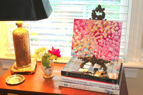
A few months ago, I had been on Pinterest and saw a fun colorful print that I loved.  Unfortunately for me, the pin didn't have a source (don't you just hate that??)  When I'd found the unnamed, un-tagged print on Pinterest, I loved it so much that I'd printed it out and framed it in our living room - where it's been sitting on the wine hutch ever since. I'd all but given up on finding out who the artist was... until today...

I was randomly combing through a few articles on Houzz, and came across an article about using coffee table books as part of your decor.  This picture was featured in the article, and what did I notice... well that painting looks A LOT like the one I'd fallen in love with!!


Overly excited, I clicked on the photo to see the quoted sources, and quickly learned that Jennifer Latimer is the artist responsible for the fun colorful abstract.  Jackpot!!

A quick Google search later, I was on her site, browsing her collection, and learning that she was recently featured on One Kings Lane as an artist to watch, and that she has a fabulous blog on home decor!  Could I be more excited??

Since I am a person that gravitates towards neutrals in furniture, I love to incorporate bright colors through art and pillows, and her bright fun abstract pieces are sort of perfect for this exact purpose.

A few of my favorites from her collection...
Banff Garden Poppies & Roses which is unfortunately sold...

Falling Petals, a Chanel Inspired Abstract


After a little digging, I discovered that her work is also sold on Etsy (yes, the news just keeps getting better) through a shop called Gilded Mint.  

How much are you loving this quad of gold seaweed paintings for $28 (buy here).


Or this four leaf clover print (buy here) also reasonably priced at $27!

Or... speaking of Flamenco's yesterday... this little guy is tres chic, and ready to hang!


Don't be surprised if you see a few more of her pieces popping up around my house... I am loving pretty much every piece in her Etsy shop!

Have you stumbled on any great sources for art recently??  I'd love to hear about it!