As you know, with our tiny kitchen (and my limited culinary skills), I am all for easy recipes. With the new year, and the inevitable resolution to try to eat healthier, I wanted to feature an AMAZING recipe from a new blog I discovered!
Dashing Dish is all about healthy alternatives for foods we all love (french fries anyone??) and aside from having great step-by-step instructions, Katie also features nutritional facts for each dish. Seriously, how amazing is that?? Her site is an amazing tool for eating healthy, she has an amazing story behind this site, and she is the most adorable little thing to boot!
Tonight I am going to try out her Crispy Baked Parmesean Green Bean Fries.
Photo via Dashing Dish
It sounds like the secret to getting these just right is to use the REALLY thin green beans so they end up crispy and french-fry-like. Keep in mind that they have a lot of water in them, so the bigger the green bean, the more water there will be, and they less crispy (and dare I say it, soggy) they will be.
Also, turning the broiler up for the last few minutes should help - I'm always a fan of cooking at higher temps for shorter periods of time. You end up with crispier results, and better crusts on things like steak, fish, brussels sprouts... you get the idea.
Check out her fabulous blog, and for details on this recipe, click HERE!!
Showing posts with label blogs. Show all posts
Friday, January 4, 2013
Thursday, October 4, 2012
Chain Link Bracelet via Cupcakes and Cashmere
Is anyone else a huge of a fan of Emily Schuman - author of the popular blog (and now book), Cupcakes and Cashmere??
For those of you unfamiliar, go check out her blog immediately - you'll learn that she is pretty much the modern day Martha Stewart. Wait, scratch that... a gorgeous, utterly fashionable, modern day version of Martha Stewart. From home decor to personal style, cooking, or hunting thrift stores, she's your gal!
Anyway, before I get too off topic singing her praises, I've noticed an adorable micro-pave chain link bracelet that she often wears.
Up close:
From a Distance:
For those of you unfamiliar, go check out her blog immediately - you'll learn that she is pretty much the modern day Martha Stewart. Wait, scratch that... a gorgeous, utterly fashionable, modern day version of Martha Stewart. From home decor to personal style, cooking, or hunting thrift stores, she's your gal!
Anyway, before I get too off topic singing her praises, I've noticed an adorable micro-pave chain link bracelet that she often wears.
Up close:
From a Distance:
This bracelet can be dressed up or down, and is a funkier, more modern take on the classic gold chain bracelet. It's more chunky, and the pave stones make it unique. It's pretty much love.
After lusting over it for a while now, I did a little hunting, and I finally found it... at JCrew of all places!! They certainly aren't giving it away at $125, but I really do love it.
What do you think - is it worth the splurge??
Friday, July 27, 2012
I have a crush...
It's true! I have a total crush on a new interior designer (well new to me) - Emily Clark. In terms of taste, I think we are kind of soulmates. I'm not even 100% sure how I stumbled up on her blog, but I swear I can't get anything done around here! Her home is amazing, and I am totally captivated because her taste and choices are what I aspire to achieve.


I have a real appreciation for designers who take some chances with color and pattern. I love the contrast of the dusty navy wall against the white curtains and fireplace, and I love how it compliments the rug, and ties the whole room together. It has been several months since we got our new dark grey trellis rug, and I've struggled to find accessories to go with it. Do the throw pillows compliment or take away from the pattern on the rug? Is it too much pattern? Too much grey?? Too geometric? These questions and doubts about decisions I've made keep me wondering why I'm not totally satisfied with the look of the room.
The conclusion?? The color and pattern of the rug is very strong, and it needs an equally strong counterpart in the room - a complimentary wall of color perhaps - to bring it all together.
Since we may end up moving towards the end of this year / early next year (the story of my adult life is packing up once a year on average), I don't want to put in the time and energy to paint the living room now... I think... but after seeing her living room (which by the way was featured in Better Homes and Gardens) I had an aha moment, and think I've figured out what we need to do in our next home to bring the room and rug together.

Can we talk about these pillows?? I am a heartbeat away from immediately placing an order for the Chaing Mai Dragon Print fabric (in mocha) to make some throw pillows for the living room. It. Is. Love.
Apparently, (and this is news to me) this fabric has made it's way around the design blogosphere, and is very "trendy" (translation: overdone) but since it's the first I've seen of it, I'm pretty sure my less design-y friends won't know or care that I totally jumped on that bandwagon.
**An update here: a single throw pillow cover in this print is looking to be in the $200 range... must find out if I can order this fabric on my own.....


Ok... in my future house, I need this office. That wall of books is making me want to stop downloading books onto my Nook - just so I can start collecting! I LOVE the contrast of the dark backing with the white shelving and the colorful books. Also, that lamp was a $70 thrift store find - originally shiny brass - that she spray painted black. I am green with envy!
And that table - the old, dinged up, antique table with turned legs?? Craigslist. I've never seen anything that awesome on Craigslist!! I'd love to hate her for her fabulous taste, and luck in tracking down amazing second hand finds, but I just love her.

The breakfast room in her old house - love the painted wall, the lantern light, and the chartreuse patterned curtains that you get a slight peek of. Is it totally creepy that I know that this is in her old house?


And at last, the formal living room in her old house (I believe possibly also featured in Better Homes and Gardens).
It's funny - I see things in other people's homes that I never knew I wanted, and suddenly I have to have them - the magic of the internet I suppose. But those birdcages are awesome, and that zebra pillow is something I must find. This room has a lot going on, but feels clean and simple at the same time. I need to learn that, because sometimes I find our home feeling cluttered even if it's not.

I have a real appreciation for designers who take some chances with color and pattern. I love the contrast of the dusty navy wall against the white curtains and fireplace, and I love how it compliments the rug, and ties the whole room together. It has been several months since we got our new dark grey trellis rug, and I've struggled to find accessories to go with it. Do the throw pillows compliment or take away from the pattern on the rug? Is it too much pattern? Too much grey?? Too geometric? These questions and doubts about decisions I've made keep me wondering why I'm not totally satisfied with the look of the room.
The conclusion?? The color and pattern of the rug is very strong, and it needs an equally strong counterpart in the room - a complimentary wall of color perhaps - to bring it all together.
Since we may end up moving towards the end of this year / early next year (the story of my adult life is packing up once a year on average), I don't want to put in the time and energy to paint the living room now... I think... but after seeing her living room (which by the way was featured in Better Homes and Gardens) I had an aha moment, and think I've figured out what we need to do in our next home to bring the room and rug together.

Can we talk about these pillows?? I am a heartbeat away from immediately placing an order for the Chaing Mai Dragon Print fabric (in mocha) to make some throw pillows for the living room. It. Is. Love.
Apparently, (and this is news to me) this fabric has made it's way around the design blogosphere, and is very "trendy" (translation: overdone) but since it's the first I've seen of it, I'm pretty sure my less design-y friends won't know or care that I totally jumped on that bandwagon.
**An update here: a single throw pillow cover in this print is looking to be in the $200 range... must find out if I can order this fabric on my own.....

Ok... in my future house, I need this office. That wall of books is making me want to stop downloading books onto my Nook - just so I can start collecting! I LOVE the contrast of the dark backing with the white shelving and the colorful books. Also, that lamp was a $70 thrift store find - originally shiny brass - that she spray painted black. I am green with envy!
And that table - the old, dinged up, antique table with turned legs?? Craigslist. I've never seen anything that awesome on Craigslist!! I'd love to hate her for her fabulous taste, and luck in tracking down amazing second hand finds, but I just love her.
The breakfast room in her old house - love the painted wall, the lantern light, and the chartreuse patterned curtains that you get a slight peek of. Is it totally creepy that I know that this is in her old house?
And at last, the formal living room in her old house (I believe possibly also featured in Better Homes and Gardens).
It's funny - I see things in other people's homes that I never knew I wanted, and suddenly I have to have them - the magic of the internet I suppose. But those birdcages are awesome, and that zebra pillow is something I must find. This room has a lot going on, but feels clean and simple at the same time. I need to learn that, because sometimes I find our home feeling cluttered even if it's not.
Friday, June 29, 2012
Dear Diary...
I've never been much on journal keeping. It starts out with the best intentions - Dear diary, it's New Year's Day, and one of my resolutions this year is to keep a running journal. This way I can document my life, and look back when I'm old and laugh at how funny/cool/carefree I was in my 20's. I'm going to write in you every day....
First and last entry. Every time.

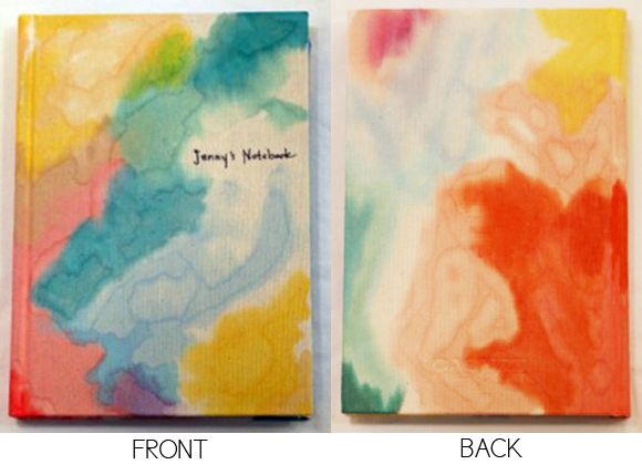
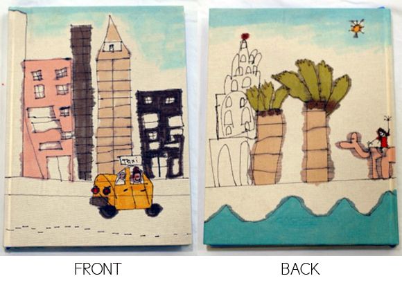
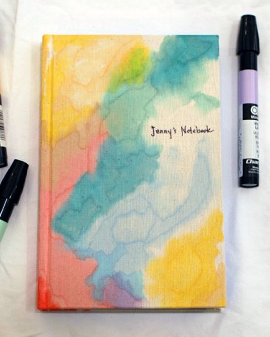
One of my favorite bloggers of Little Green Notebook is crafty, and a total genious, and had the lovely idea for her kids to make notebooks for their teachers as a gift on the last day of school. Theirs were adorable (handdrawn pictures of what they thought their teachers would be doing for their summer vacation) but I LOVED the one she made - using charpak markers, and a blender marker. It looks like watercolors meets tie-die, and I'm convinced that with a cool notebook like this, I could successfully keep a diary... maybe.
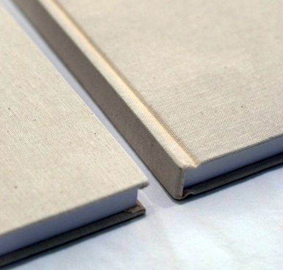
The notebooks started out looking like this:

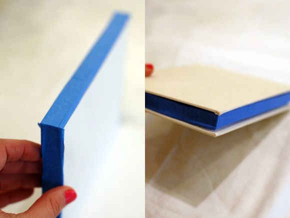
She taped them off like this (to keep the pages fresh and white):

Her kids' notebooks ended up like this (so adorable):

But I just love the abstract, color wash effect of hers... might totally copy this idea

Check our her entry here!
First and last entry. Every time.

One of my favorite bloggers of Little Green Notebook is crafty, and a total genious, and had the lovely idea for her kids to make notebooks for their teachers as a gift on the last day of school. Theirs were adorable (handdrawn pictures of what they thought their teachers would be doing for their summer vacation) but I LOVED the one she made - using charpak markers, and a blender marker. It looks like watercolors meets tie-die, and I'm convinced that with a cool notebook like this, I could successfully keep a diary... maybe.
The notebooks started out looking like this:

She taped them off like this (to keep the pages fresh and white):

Her kids' notebooks ended up like this (so adorable):

But I just love the abstract, color wash effect of hers... might totally copy this idea

Check our her entry here!
Monday, February 27, 2012
Blog Redesign: New Blog Header
So, I've been logging some serious hours re-designing my blog header. While I loved the greek key's, I realized that it was so similar to several other blogs that I had seen, and as frustrating as it was to head back to the drawing board... it was a must.
Take a look at the finalized iterations that have gone live on the blog - oh how they have evolved!
Aside from fully overhauling the header, I also went to work on the fonts, colors, and blog backgrounds. I still loved the burnt coral I had before for the links and titles so that stayed. I've also been harboring an unhealthy obsession for navy, so I've decided to keep those bold accents within the right hand navigation menu. Outside of that, everything changed from the font, to the font sizes, to the template, to the shading, to the width... oye vey! I picked a dark grey/blue color for the gutters (is that the word for it?) because it reminded me of dusk. An easy decision, but I needed to find a complimentary color for the header that didn't clash with all the other colors. A Grey header felt drab and too matchy-matchy, and burnt umber was overkill... WAY too much orange. After many MANY versions, I settled on the lovely aqua trellis pattern with a muted navy stripe.
I am happy with it for now. I think the aqua compliments the coral (aqua and coral... after so much talk about it, I couldn't resist), and it brightens up the whole page. A little fading here, a little shadow there, and a little reflection to give it some personality... Give it another few weeks, and I'm sure that I will have tweaked it some more. As in life, nothing is ever "perfect" or "finished"... it's always a work in progress!
Take a look at the finalized iterations that have gone live on the blog - oh how they have evolved!
Aside from fully overhauling the header, I also went to work on the fonts, colors, and blog backgrounds. I still loved the burnt coral I had before for the links and titles so that stayed. I've also been harboring an unhealthy obsession for navy, so I've decided to keep those bold accents within the right hand navigation menu. Outside of that, everything changed from the font, to the font sizes, to the template, to the shading, to the width... oye vey! I picked a dark grey/blue color for the gutters (is that the word for it?) because it reminded me of dusk. An easy decision, but I needed to find a complimentary color for the header that didn't clash with all the other colors. A Grey header felt drab and too matchy-matchy, and burnt umber was overkill... WAY too much orange. After many MANY versions, I settled on the lovely aqua trellis pattern with a muted navy stripe.
I am happy with it for now. I think the aqua compliments the coral (aqua and coral... after so much talk about it, I couldn't resist), and it brightens up the whole page. A little fading here, a little shadow there, and a little reflection to give it some personality... Give it another few weeks, and I'm sure that I will have tweaked it some more. As in life, nothing is ever "perfect" or "finished"... it's always a work in progress!
Wednesday, February 15, 2012
Can I Live Here... Please?

I have just discovered Lonny - a gorgeous online site with design inspiration, but the best part (yes it gets better) is their online magazine!! I want to live in it's pages. I think I'm in love.
They have the standard site that is organized by category (living room, bedroom, kitchen, etc), where the photos are displayed in a gallery format - just browse and click. It's very visual, and very lovely. In addition to their site, they have a digital magazine where you virtually flip through the pages - very tactile. It would be fabulous on an ipad, because honestly there is just something so therapeutic about flipping through the pages of a magazine. Right?! New LOVE.


Tuesday, January 24, 2012
Blog Redesign
For quite some time I have become annoyed that my blog looked sort of sad. I hated the logo even though I had originally spent hours experimenting during the first round of design. It just looked grainy, and really boring. I have this huge monitor so there was just a lot of white space that I didn't particularly like, and after a few weeks of playing around with graphics on my computer, came up with a new fresh design!
What do you think?? I'm by no means a designer, but I am pretty proud of how it turned out!
Lately, I've been really into graphic prints, from throw pillows, to wallpaper, to fun dresses... I am sure in another few months I'll be tired of the Greek Key print, or want to re-work the shading (wouldn't it be fun to have the logo fade out?!) but for now, it's a vast improvement from the previous scroll design.
What do you think?? I'm by no means a designer, but I am pretty proud of how it turned out!
Lately, I've been really into graphic prints, from throw pillows, to wallpaper, to fun dresses... I am sure in another few months I'll be tired of the Greek Key print, or want to re-work the shading (wouldn't it be fun to have the logo fade out?!) but for now, it's a vast improvement from the previous scroll design.
Wednesday, December 21, 2011
Style Me Pretty - the creme de la creme

So one of my amazing friends Aimee is just as obcessed with weddings as I am. She got married just over a year ago, and while she loves the glamour, the details, and of course what the wedding symbolizes, the wedding planning experience was less than stellar for her. To put it simply, Aimee's mother-in-law was less than supportive, and did her best to undermine every decision she made.
Despite the hurdles with her in-laws, she was married to her long-time college sweetheart and they are currently living happily ever after. Months after her stressful wedding, her florist approached her with an opportunity to get back in her gorgeous Lazaro wedding dress, and participate in a photo shoot for a Style Me Pretty submission. I get a text from her one morning at work saying, "I am playing hooky from work and am wearing my wedding dress!" Needless to say, I was shocked, intrigued, and a bit worried for her sanity at the same time.
Later, over cocktails she spilled the rest - "I am trying to get on Style Me Pretty" she exclaimed - she did not even need to say anything more. I have been a SMP loyalist for years, pouring over the endless gorgeous details of thousands of weddings, so I fully understand the importance of being featured on this holy grail of blogs. We celebrated to the fullest - perhaps over-celebrated a bit ordering not one, but two bottles of champagne and very little dinner.
Over the next several weeks I checked StyleMePretty incessantly, looking for her lovely face, but nothing. I had almost forgotten about the entire photoshoot when one day at work I was browsing the blog, and found myself staring into the brown eyes of my dear friend.
"OH MY GOD," I squealed at work... let me interject to add that my team at work consists of baby 20-somethings who did not end up understanding the importance of any of this when I tried to explain my excitement. Still buzzing with excitement, I shut the door and proceeded to call Aimee for the details, and then my best friend Kira to relay the details (a fellow wedding obsesser).
In few words, Aimee looked stunning in a very non-Aimee way. To know her is to know the epitome of "classic", and this photo-shoot was anything but - it was extremely avant garde and artsy - so lovely.


Go check out the rest of the gallery here.
Thank you to the very smart editors at SMP who chose her photo-shoot to post, and also for writing and maintaining one of the loveliest blogs I know.
Tuesday, October 4, 2011
Feeling Cozy

After the sun and warm weather from vacation, I have come back to San Francisco where the weather is chilly, and the days are getting shorter. Sitting at work, it really feels much later than it is right now and I am feeling the need to curl up in an overstuffed chair with a cozy sweater and a steaming cup of cocoa.
While I can't be preparing for a long winter's nap, and pad around my apartment in my slipper socks until after work, one of my favorite afternoon rituals is to make some tea, and read through my favorite blogs. It's soothing, and even under the flourescent lights, its a lovely break that feels like meeting up with friends, and discussing anything and everything from party planning and DIY projects, to babies, to weddings, to travel, design, and art.
STYLE ME PRETTY:
For wedding inspiration, and all things pretty, StyleMePretty is the ultimate. The dresses and soires are so soft and romantic, I could easily get lost in this world of whimsy, flowers, and ruffles.
OH HAPPY DAY:
She is a native San Franciscan, but picked up her life - husband, kids, and career - and moved to Paris for a year. She has guts, and is loaded with creativity as a party planner, and blogger extraordinaire. Her blog OhHappyDay inspires me, both in design, creativity, and guts... I really just feel happy when I read her posts.
CUP OF JOE:
An ultimate New Yorker, she manages to stay hip as a mom, and honestly I just want to be her friend. She is utterly cool, and blogs about family, motherhood, fashion, art and design. Somewhere in the mix are weddings, and wisdom that applies to life, love, goals and being happy. It's sometimes therapeudic, and I want her life one day.

Subscribe to:
Posts (Atom)