This is a picture from about a year ago but nothing has changed except that small metal table is now gold. The layout isn't awful, but I'm not totally loving it, so I think we need to move some things around...
The Christmas tree had been in the window where the wicker chair is in the above picture, but it's back to this layout - here is an areal view of the living room set up:
The empty space between the seating area with the sofas and the wicker chair / desk flat against the wall is what bothers me. There is no definition between these two spaces and it drives me crazy! Another issue with this layout, is that the desk sticks out, making it feel "crowded" as you walk in the room.
I am thinking that by removing the wicker chair, and the awkward small table next to the TV (that is too low to the ground) that the layout will be greatly improved... here is a revised version of the areal layout...
To quickly recap the changes I'm thinking... I want to move the desk next to the window, so you aren't "walking into it" when you first enter the room. I also want to remove the awkward short table that was directly to your left when you entered, and replace it with the wine rack that is currently in our dining room. The wine rack is taller, so it will sit at the proper height for the height of the mirror, and I think it makes a lot of sense here. Also, our dining room is teeny, so it will free up more space in there. The wine rack is more narrow than the Ikea table that is there now, so I think that's also a benefit.
The wicker chair will go into storage, or I'll try to sell it on Craigslist, and next to the desk, we'll bring in more light with a pretty standing lamp... maybe something like this tripod lamp

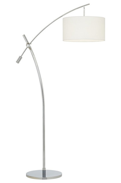
or this lamp that pivots - it's just kind of cool and I LOVE that big drum shade...

Once we move the desk over next to the window, there will be quite a bit of exposed wall below the large abstract painting. It's possible that I'll like it, but right now, I'm thinking that a few small X benches would be perfect down there. Aside from being pretty, they'll also be practical, providing extra seating for guests.
Finally, I want to bring in seating to the third side of the coffee table. In my mind, I'd see a comfy overstuffed chair there...
Something like the Pottery Barn Manhattan chair looks SO comfy...

But that might be too bulky for this space - maybe something smaller (but still comfy) like a slipper chair would do the trick there... something in a fun print like this could be fun...


What do you think of the updated layout?? I am TRYING to work with what I have, and I think moving some of our existing furniture around will absolutely work!


Love these ideas! I think you could almost do 2 new chairs where you are thinking one overstuffed and face them towards the coffee table (rather than angled.) Then, you have two divided spaces! Love the second lamp and third chair!
ReplyDeletexo
ann e
annelliott.blogspot.com
Yep!! Totally considering two chairs as well! Just need to find a chair and then see if two would be too crowded :-) hope your having an awesome weekend!
DeleteThis article is very useful for me, thank you for sharing it, Just loved the way you presented it. Keep up the good work.
ReplyDeleteTeam designs, AU
- 3D Rendering
- 3D Architectural Rendering
3D Rendering services express the client's idea in a 3D digital image or file with 3D artists that can be directly converted into a final project using 3D Render from 3D Team, Australia.
ReplyDelete